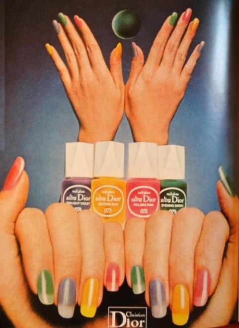
For the first time ever, nail polish is outselling lipstick. I picked up this little tidbit of knowledge [along with plenty of color trend info] in Thursday’s webinar: Pantone View home + interiors 2013. In case you missed out, here are my notes:
Laurie Pressman, Vice President of home and interior fashion at Pantone, the globally recognized authority on color, shared some of the color trend research and forecasting for the coming year. The overall theme for 2013 is “Fantasies and Realities”. This plays off the fact that today’s consumer wants something that is both delightful to the senses AND practical. As Pressman stated:
In order to create the “magic” in the market place that ultimately leads to sales, colors for 2013 will need to coax and cajole, soothe or astonish,renew and replenish. At the same time, there will be the consumer’s expectation of practicality – which colors will have staying power and can be relied upon as a steadying influence in unsteady times. Skillfully balanced color palettes that play to their practical side, while satisfying their aspirations, hopes and needs for something novel, will remain key to enticing the would-be consumer or client.
So let’s create some magic… Pantone has laid out several color palettes that we can expect to see in the next year. These pallets are more than just a couple color swatches, they are entire style profiles. Color is the foundational inspiration.
2013 Palettes
- Elegant and Old-worldy – Pastels, off whites, understated drama, champagne beige, silver. These are your neutrals with a muted luxurious flavor.
- Sleek/Sensuous – Think art deco and peacock feathers, dark, bold, dramatic. Black, white, red, blue, purple, abstract patterns.
- New-Old School – Reminders of past, twisted traditional/quirky prep, patriotic, nautical, and school uniform color schemes, similar but not as heavy as palette number two.
- Cowboy and Cowgirl. Dusty pink, clays and denims. Focus on rugged comfort and recycled and up-cycled materials, woods and leathers.
- Footprints – Deliberate, bright colors, you’ll see a continuation of 2012’s oranges, and pinks with rich blues and greens.
- Sojourn – Plums, muted jewel tones, a more saturated version of pallet number one.
- Surface Treatments – All about textures, blues, greys, influenced by aquatic, vegetation, and metals
- Out of the ordinary – Amusing and entertaining is the goal – bright, “off”, out of the ordinary, rich jewel tones.
Additionally, we will continue to see a more developed range of neutrals and greys, and neons will continue to have traction. This can be seen as a reflection of the transportation industry; you have your safety color neons, signs, stripes, reflective surfaces, alongside asphalt, metals, rubber, and maybe even some street art along the way. Mix that with an environmental focus and you have a few blades of bright green grass added to the color scheme.
So what does nail polish have to do with all this? Nail polish color research and development are actually considered an authority when it comes to the hottest hues. Nails are one of the easiest, fastest, and most affordable and therefore most popular ways for a consumer to try a new color, literally putting the latest trends right in [or on] your hands. So maybe next time you’re looking for some color inspiration, check out the ads in a current fashion magazine and make your way over to the beauty department. Or maybe just get a new manicure.
Here’s to a colorful 2013! Cheers!
alissa jean

